Crystal Cave
Crystal Cave Research
This time, I decided to pay more attention to the crystal cave references I particularly liked and how they distributed their crystals before redesigning the crystal cave. Shown below are the images I collated.


In the references above, the colour schemes for the crystals do not consist of many different colours and the colours that they do include complement the cave colours well – they also do not majorly contrast the cave colours. The colour schemes I especially liked were the blue-saturated ones so the references I chose all utilise a blue-central colour scheme. I also wished to use a similar colour scheme in my own design.
New Crystal Cave Design
When I began the redesigning process, I decided to keep in mind the two previous designs and what I wanted retain from them as well as remembering the advice I was given by the team – use only a few different colours for the crystals, a few different types of crystals, keep the crystal designs simple/orthodox, make the crystals similar in size, lower the amount of crystals and don’t incorporate additional objects.
What to retain –
The layered look
The cave shape
The various rock formations
The pond
The varying sizes of the crystals

Next, I decided to keep the different types of crystals I incorporate to two. Once again, I used the reference below to choose the types of crystals to implement.

Shown below are the crystals I chose. I had wanted a crystal consisting of several crystals with the other consisting of only one. I also wanted the two crystals to differ in terms of shape but not so drastically that they would fail to complement each other. I also thought that the two crystals possessed complementary colours – they both possessed blue hues in light shades. This supported the blue colour scheme I wanted to incorporate into the new crystal cave design.

Shown below is the new crystal cave design. I drew the layout using the colours I wanted to incorporate. I kept the cave shape similar to the previous design and retained the pond to make for a more dynamic design. Regarding the crystals, I decided to slightly further diversify the two crystal types by adding crystals to some of the designs. I ensured that it didn’t cause the crystals to vary too much in appearance whilst doing so.
After I finished the design, I sent it in Slack to show the team in order to gain their approval before continuing onto painting the crystal cave. My design was approved by the group.

Art Style Research
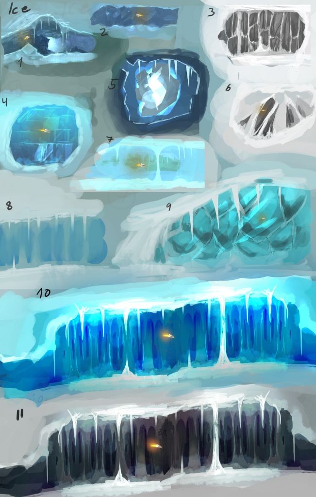
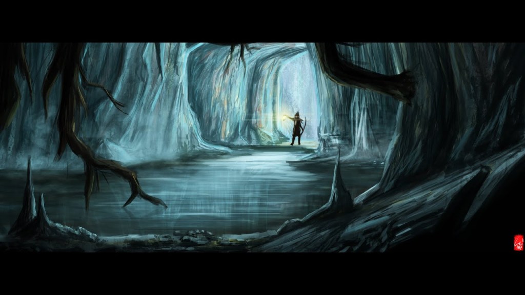
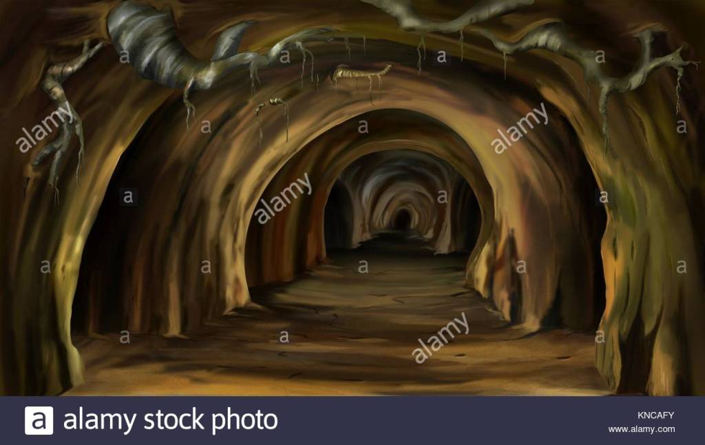
Before I began painting the new crystal cave design, I decided to further research different art styles I could utilise in the painting. Shown below are the references I used during the painting process. They served as a basis for the styles I used to paint the cave.
Art Methods Research
Before I began painting the crystal cave, I also decided to further research different methods of digitally painting rocks/rocky surfaces and caves to see which method seemed to best suit the game’s art style. I also has to keep in mind the project deadline – whichever method I chose had to be one I could utilise in a timely manner.
Additionally, I had wanted to explore the different methods to gain an idea for how one could efficiently paint a cave – it was something I had little experience in so I thought researching and trying out various methods was a good way of improving my knowledge/skills.
Photoshop Painting – Mountain Cliff
https://youtu.be/EqZ4fiMV8Es
Painting a Mountain: Digital Painting Process
https://youtu.be/icUCD0wWLx8
How To Paint ROCKS in Photoshop
https://youtu.be/L72WR8ZXAWQ
Hand-Painted Texture Tutorial: Stone
https://youtu.be/fNa49OY0o9E
CRYSTAL CAVE DIGITAL PAINTING Time Lapse Photoshop CS6
https://youtu.be/wpgDW30lNtw
The Cave of Silence (Digital Painting)
https://youtu.be/fsNd5hlspnk
Furthermore, prior to painting the cave, I made two colour palettes – one for the cave and one for the crystals – so that I could plan the colour scheme prior to the drawing process. I thought it would help me stay focused as well as making it easy for me to colour-pick the shades I want.
I used the second image from my ‘art style research’ to create the cave colour palette whereas the crystals colour palette was based on the two chosen crystals.
Cave Colour Palette

Crystals Colour Palette

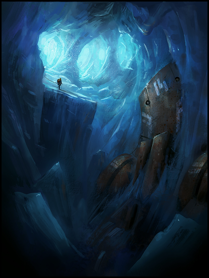
Shown below is the first draft of the crystal cave painting.
New Crystal Cave WIP (version 1)

I liked the colours used for the upper half of the cave but I thought that the ground and the pond’s colours didn’t complement the rest of the cave or each other. The ground’s colours were too faded and the pond blended in too much with the crystals. The ground’s shading also needed polishing.
Additionally, the two platforms’ colours were slightly too contrasted for my liking and the uppermost rock formation lacked contrast. I also had to polish the crystal shapes and finish giving them outlines to help with shading them later.
In order to remedy all these issues, I firstly decided to increase the contrast of the uppermost rock formation and painted it to make the rocks more defined.
Next, I polished the ground using colours from the uppermost rock formation. I also painted the two platforms more to make their colours lessen in contrast.
Finally, I repainted the pond in different colours to make it contrast the crystals and stand out more. I also polished the crystal shapes and finished outlining all the crystals.
Shown below is the edited version of the crystal cave painting draft.
New Crystal Cave WIP (version 2)

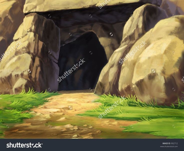
Crystal Cave Entrance
Art Styles Research

Leave a comment